Project Description
Tri-state Non-profit
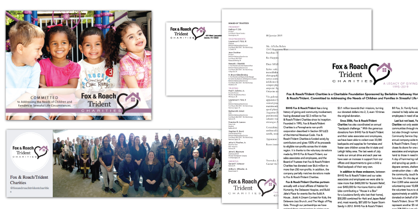
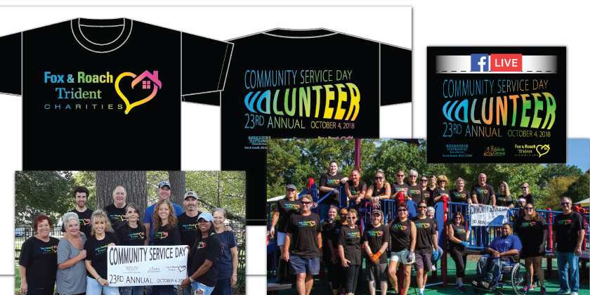
An organizational name change meant a new logo design was needed. This well-established non-profit has deep community roots in helping children with stressful life and housing circumstances throughout Pennsylvania, New Jersey, and Delaware.
As when rehabbing an historic building, this rebrand required me to keep certain things in mind, plus maintain specific, original elemental features. Such as:
. Parent company’s brand
. Addition of affiliate’s name and brand
. Charities’ original brand design
As well, Charities frequently refers to their work as “being from the heart,” and with one final request, “Is there any way for you to find a color that will work with the (parent company’s color) cabernet?”
Since all three logos are frequently on display together, they must play nicely together. The rebuild:
. Parent company’s font implemented
. Affiliate’s font added (also one of my rebrands from 2013)
. Concept from Charities original logo maintained
. Graphic element designed to represent “housing with heart”
. Color is a nod to the parent company’s cabernet
To compare the two logos, check out the before-and-after element.