


Project Description
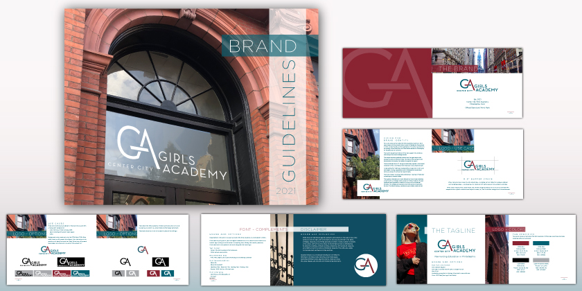
The Brand
M I S S I O N
Educating Young Women to Lead with
Integrity and Courage, and to Excel With Confidence.
The Vision for the Brand
Two colors make up the Center City Girls Academy’s brand icon. Each were chosen with the school’s historic roots in Philadelphia, Pennsylvania in mind. As well, the girls, as future graduates of the school, are history in the making; in the forefront as our future female leaders for Philadelphia, for Pennsylvania, for our world.
The brand’s deeply hued brick red in the icon speaks to the red stone which wraps the school building’s facade.
The unique blue was specifically chosen from the aged copper metal which encases the school building’s window frames. Its richly patinaed color demonstrates the unique beauty that resides throughout this historic city.
The hand-lettered icon’s “G” simply and effectively speaks to the forward movement of life. A continuous flow where ever one is along their path.
Its descending “A’s” right leg is representative of angle iron in both color and weight; a loving, appreciative nod to Philadelphia’s foundational history as pioneer in our Country’s steel industry.
The icon’s crossbar is purposefully outstretched. It reaches in “welcome,” connecting any crossed divides.
The nameplate’s typeface, Neutraface, is a hand-lettered font from House Industries, a type foundry and design studio, located in Yorklyn, Delaware. House’s typefaces have appeared on television, in film, and on commercial products. This progressive typeface’s unobtrusive style complements the icon. The letters’ kerning provides an open-minded, aired out feel.
Center City Girls Academy
Est. 2021
Philadelphia, Penn
Official Brand and Word Mark